In This Guide:
• The mathematical speed of first impressions | • 10 pillars that establish digital credibility | • 7 critical design mistakes that turn customers away | • Interactive professional layout checklist
Table of Contents
- The Psychology and Reality of First Impressions
- Why Website Design is a Core Business Decision
- 10 Core Elements That Make a Website Look Professional
- 7 Common Mistakes That Make a Website Look Unprofessional
- The Professional Design Checklist for Business Owners
- How Professional Design is Actually Created (Our Process)
- Design for Your Audience, Not Your Own Personal Taste
- Frequently Asked Questions (FAQ)
Research shows that visitors form an opinion about a website in less than 50 milliseconds — that is 0.05 seconds — before they have read a single word. That first impression is based entirely on how the website looks and feels. If you think about it, it takes longer to blink than it does for a potential customer to decide whether your business feels trustworthy online.
In our years of building and redesigning custom websites for small businesses, clinics, startups, and service providers across India and internationally, we have seen the same pattern repeated over and over. A business owner is proud of their website — until they see what a professionally designed one looks like next to it. They realize that while their site might have all the right facts, it doesn't have the right feel.
The difference between a professional website and an amateur one is not always obvious to the untrained eye. It is rarely about one single, massive error. Instead, it is a compilation of dozens of tiny design details. But the difference is felt immediately by every visitor who lands on your page.
Why Website Design is a Business Decision — Not Just an Aesthetic One
Professional website design is not about winning design awards or impressing other designers. It is about building trust with your potential customers fast enough — before they lose patience, click the back button, and leave for a competitor.
"Design is not decoration. It is communication." – Kwikk Design Lab Philosophy
According to research, 75% of consumers admit to judging a business's credibility based entirely on its website design. That means three out of every four visitors to your website are making a high-stakes trust decision based on visual appeal before they read your services, check your prices, or look at your testimonials. If your website looks amateur, they assume your service is amateur too.
We see the direct business impact of design across every single project we work on. We see it in before-and-after redesigns where enquiry rates visibly improve without any change to the client's actual services. We see it when clients replace generic DIY template builders and immediately notice more professional, serious responses from potential customers. And we see it when businesses invest in proper custom branding and begin attracting higher-value, better-paying clients. In business, how you communicate your credibility determines your conversion rates.
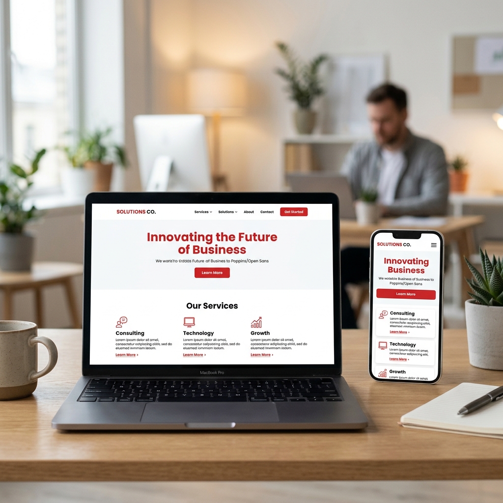
What Makes a Website Look Professional
Professionalism in web design is not a mystery. It is a set of design disciplines applied consistently. Here are the ten core elements that combine to make a website look professional:
Element #1 — Clean, Purposeful Layout
A professional website has a clear visual hierarchy. The most important information (your value proposition and primary CTA) is the most prominent, and every element on the page has a reason to be there. White space — the empty space around text and images — is used deliberately to give content room to breathe. Think of it like a well-designed retail shop interior. Products are displayed clearly, aisles are easy to navigate, and nothing is piled on top of something else. Nothing feels crowded, rushed, or random.
Element #2 — Consistent Branding
Every page of a professional website uses the same colors, the same fonts, the same tone of voice, and the same visual style. This consistency tells visitors they are in a coherent, considered brand environment, not a patchwork of random design decisions. Consistent branding means choosing a primary color, an accent color, and a neutral background, and sticking to them. It means using the same button style on page one as you do on page ten.
Element #3 — High-Quality, Authentic Imagery
Images on a professional website are sharp, well-lit, and relevant to the business. They show real products, real office spaces, and real team members — not generic stock photos of corporate models shaking hands in glass office buildings. Photography quality signals business quality. Blurry, poorly lit, or obviously fake images immediately undermine even the best-designed layout.
Element #4 — Readable Typography
Professional websites use fonts that are easy to read at all sizes, on both desktop monitors and small mobile screens. Font sizes are generous (minimum 16px for body text), line spacing is comfortable, and text is never placed over a busy background that makes it hard to read. A maximum of two font families — one for headings, one for body text — is almost always the right decision. More than that starts to look chaotic.
Element #5 — Fast Loading Speed
A website that takes more than three seconds to load does not look professional, regardless of how beautiful the layout is. Speed is part of the user experience. A visitor who waits for a slow page to load has already formed a negative impression before they see a single pixel of your design. Professional design includes optimization of images, scripts, and server response times.
Element #6 — Mobile-First Design
A professional website looks and works perfectly on every device: phone, tablet, and desktop. Menus collapse cleanly on mobile, buttons are tap-friendly with adequate spacing, images resize correctly, and text is readable without zooming. A website that breaks or has horizontal scroll bars on mobile is not a professional website in 2026. Full stop.
Element #7 — Intuitive Navigation
Visitors should be able to find any page on your website within two or three clicks, intuitively, without having to think about it. Navigation menus are clearly labeled, logically organized, and never more complex than necessary. If a visitor has to search for your contact details or list of services, your navigation structure has failed.
Element #8 — Intentional Use of Colour
Professional websites use color intentionally to guide attention, not randomly to decorate. Primary brand colors set the tone, neutrals provide readability, and a high-contrast accent color is reserved exclusively for call-to-action buttons. When colors are used systematically, visitors naturally know where to look and what actions to take next.
Element #9 — Professional Copywriting
The words on your website matter as much as the design. Spelling errors, grammatical mistakes, and poorly written content immediately undermine a professional visual design. Content should be clear, concise, and written with the visitor's needs in mind — not stuffed with industry jargon or written as an internal company memo.
Element #10 — Functional Details
Every link works. Every form submits correctly. Every button does what it says it will do. Broken links, 404 error pages, and non-functional contact forms are the digital equivalent of a shop door that does not open properly — they tell visitors the business does not pay attention to detail.
Every website we build goes through a structured design process — mood boards, brand style guides, mobile-first prototypes, and thorough cross-device testing — before a single line of final code is written. Because professional design is not something that happens by accident. It is the result of a deliberate, disciplined process.
What Makes a Website Look Unprofessional — And What to Fix
In our work reviewing and redesigning websites for clients across India and internationally, these are the design problems we encounter most consistently — and the ones that do the most damage to a business's online credibility:
Problem #1 — Inconsistent Fonts and Colours
Four different font styles on the same page. A green button here, a blue button there, a red one somewhere else. Each page looking slightly different from the last. This is the most common sign of a website built without a design system — and visitors feel the lack of coherence even if they cannot name it.
FIX: Define a brand color palette (2 to 3 colors maximum) and a typography system (2 fonts maximum) and apply them consistently everywhere.
Problem #2 — Low Quality or Generic Stock Images
Blurry product photos taken on a phone. Generic stock images of strangers shaking hands in a generic office. Pixelated logos stretched beyond their original dimensions. Poor image quality is one of the fastest ways to make an otherwise decent design look cheap. Visitors associate image quality with product quality.
FIX: Invest in professional photography for key hero images, or use high-quality, carefully chosen stock images from Unsplash or Pexels. Compress all images for web without losing quality.
Problem #3 — Cluttered, Overcrowded Layouts
Too much text. Too many images. Too many colors. Too many sections fighting for attention on the same page. The instinct to put everything on the homepage is understandable, but it results in a page where nothing stands out because everything is shouting at the same volume. More content does not mean more credibility. Less, done better, always wins.
FIX: Ruthlessly edit every page. If a piece of content does not serve a specific purpose for the visitor, remove it. Embrace white space as a design tool, not wasted space.
Problem #4 — Outdated Design Aesthetics
A website that looks like it was built in 2012 — complete with textured backgrounds, animated GIFs, beveled buttons, and a layout that does not respond to different screen sizes — tells visitors the business has not evolved. In 2026, an outdated website is a credibility problem, not just an aesthetic one.
FIX: If your website is more than 3 to 4 years old and has not been updated, it is working against you. A redesign is an investment in credibility, not just appearance.
Problem #5 — Poor Mobile Experience
Text too small to read. Buttons impossible to tap. Horizontal scrolling. Images that overflow the screen. A website that works on desktop but breaks on mobile is not a professional website — it is half-finished. And in India, where over 90% of visitors are on mobile devices, it is the version of your website that matters most.
FIX: Test your website on your own phone right now. If anything does not look or work correctly, that is what your customers are experiencing.
Problem #6 — Missing or Weak Calls to Action (CTAs)
A beautiful website with no clear instruction on what to do next is like a beautifully designed shop with no staff, no price tags, and no register. Professional websites guide visitors clearly and confidently toward the next step.
FIX: Every page needs at least one clear, prominent, action-oriented CTA button — visible without scrolling on the homepage.
Problem #7 — DIY or Template Design That Shows
The default template that came with a website builder. The free theme that ten thousand other websites also use. Placeholder content still visible in a footer. These signal to visitors that the business did not invest in its own presence — and raise questions about whether it will invest in theirs.
FIX: A custom-designed website — or at minimum a heavily customized template with a clear brand identity — signals that your business takes itself seriously.
Almost every website that comes to us for a redesign has at least three or four of these problems. They are extremely common — especially on websites that were built quickly, built cheaply, or built by the business owner themselves without design experience. None of them are insurmountable. All of them are fixable.
The Professional Design Checklist
Use this checklist to honestly evaluate your current website. Ask: does my website do this consistently?
Layout & Structure
- Clean layout — nothing cluttered or crowded
- Clear visual hierarchy — most important info most prominent
- Generous white space on every page
- Every page element serves a clear purpose
Branding Consistency
- Maximum 3 brand colours used consistently
- Maximum 2 font families throughout the entire site
- Same visual style on every page
- High resolution logo displaying correctly everywhere
Imagery & Visuals
- All images sharp, well-lit, and high resolution
- No generic or obviously fake stock images
- Images represent the real business, team, or services
- No stretched, pixelated, or poorly cropped images
Typography & Content
- Body text minimum 16px — readable without zooming
- Text never placed over busy background images
- No spelling or grammar errors anywhere
- Content written for the visitor — not the business owner
Mobile Experience
- Website looks professional on mobile devices
- All buttons are tap-friendly on touchscreen
- No horizontal scrolling on any mobile screen
- Text readable without pinching or zooming
Speed & Functionality
- Pages load in under 3 seconds on mobile
- All links work — no broken pages
- All forms submit and confirm correctly
- SSL certificate active — padlock visible in browser
Calls To Action
- Clear CTA on every page
- Primary CTA visible above the fold on homepage
- CTA buttons consistent in colour and style throughout
How Professional Design is Actually Created
One of the most common misconceptions about professional website design is that it is a matter of pure subjective taste — that some designers just have a "good eye" and others do not. In reality, professional web design is the result of a structured, disciplined process. Here is how we approach it for every client:
Step 1 — Brand Discovery
Before we design a single page, we understand the business deeply — its values, its target audience, its competitors, and the impression it wants to create. Design without this foundation is just decoration.
Step 2 — Mood Board & Style Guide
We create a mood board — a visual reference of the design direction — and a style guide that defines the color palette, typography, button styles, and visual language for the entire website. Every design decision made after this point references the style guide. This is what creates consistency.
Step 3 — Mobile-First Design
We design the mobile version of every page first — because that is where most of our clients' visitors come from. Once the mobile experience is perfect, we scale it up to tablet and desktop screens.
Step 4 — Prototype & Review
Before any coding begins, the client reviews and approves a visual prototype of the website. Changes are far easier — and far cheaper — at this stage than after development is complete.
Step 5 — Cross-Device Testing
Every page is tested on multiple devices and screen sizes before launch — not just in a browser simulator, but on real phones and tablets. Because real devices reveal real rendering problems that simulators miss.
This process is not unique to large agencies or expensive projects. It is how we approach every website we build — because we have seen what happens to websites built without it, and we choose not to deliver that to our clients.
Design for Your Audience, Not Your Own Personal Taste
One of the most important — and most frequently overlooked — principles of professional web design is this: the website is not for you. It is for your customers. Your personal taste in colors, fonts, and layouts may be completely different from what resonates with your target audience. A clinic website designed to appeal to a 45-year-old patient seeking medical care looks very different from a salon website designed to appeal to a 25-year-old style-conscious customer.
Professional web design always starts with the question: who is this for, and what do they need to feel when they arrive on this website? Common client mistakes this principle addresses include choosing a color scheme because it is a personal favorite, adding content that the business owner finds interesting rather than what the customer actually needs, and copying a competitor's design style without considering whether that competitor's audience matches yours.
The best client relationships we have are the ones where the client trusts the design process — brings their brand knowledge and business goals, and lets the design expertise do the rest. The result is always a website that works harder because it was designed for the visitor, not the owner. When the design gets better, the results get better.